Hows and whys of samueland.dev
Posted on March 28, 2025
If you're reading this, then I have finally published my own website. My goal with this site, whimsically titled "samueland," was to create a centralized, stylish warehouse from which others could get a good idea of my work, my interests, and my vibe. I've always felt like I have a lot of really neat projects I'd love to show others, but there was no easy way I could do that. Until now.
I like to think of it like a virtual business card. I've spent hours experimenting between a bone or eggshell colored background, adjusting line heights to make it perfectly presentable and spatially efficient, aching my back leaning over my desk trying to catch the light in order to make it readable in all environments. Of course, I would hope that anyone who stumbles onto my website will appreciate these tiny flourishes, but at the end of the day, this website is just a means of communicating myself; if I can manage that, I am satisfied.
A short development history
The whys of making this site are quite simple; the hows are a bit more interesting. Like many before it, my site began as a humble little index.html, nestled deep in the recesses of my projects folder. At this point, all stylings were inline, and I was trying to find a layout that fit my somewhat high requirements. A major influence on the design of the site is the so-called "Swiss Style" of graphic design. Originating from the 1950s, the style tends to emphasize minimalism, grid layouts, and religious use of Helvetica (back then, they probably used Neue Haas Grotesk, or before that, Akzidenz-Grotesk).
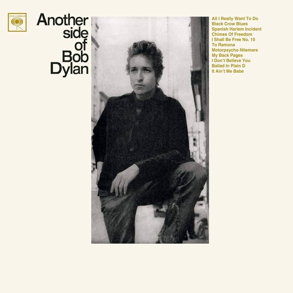
Another influence was the cover art for Bob Dylan's fourth studio album, "Another Side of Bob Dylan." I'm not sure why, but the cover art really spoke to me (the actual album itself is OK. I much prefer his work from a few years later). The detailed yet minimalist text; the disheveled look of the title font; the warm, vintage hues of white and black; all these details come together to form a striking cover. Sidenote: I've scoured the internet for the exact font used by the title, but other than finding an awesome resource for tracing fonts (FontsInUse), no dice.

This collection of influences gave rise to (I hope) a unique look and feel for a website: buttery off white with off black text, Helvetica for days, and a rigid, grid-like structure. I like it because it feels professional, but not sterile; businesslike, but not corporate. You get the idea.
Choosing a framework
At some point while I was plodding along developing projects.html and other pages, I realized that for what I wanted to do, I needed a framework. I didn't need anything crazy (this is still just a static site), but I knew development would speed up if I was working within a larger framework.
So I did what any developer would do and ported the pages over to a Next.js project. Whatever your opinion on Next.js may be, my main reason for using it is that it's what I am most comfortable with, and I wanted to get this out as fast as I could. There are definitely platforms which might suit me better, are probably faster, maybe even easier to work with, but when I made this site, Next.js was the best choice for me, and that's really all that matters.
In my opinion, it paid off: my site has a working blog, nested navigation, and even a dynamic poetry viewer. Of course it's not perfect, but so far, so good. My favorite of these features I've added thus far is the "PICO-8 Games" section. It's impossible to describe how rewarding (and sort of frightening) it feels to finally document things you've made years ago and realize, "Wow, now anybody can see my art. Not just me."
Dealing with lots of content
At the start of this site's life, I wasn't entirely what content it would host. I knew I needed the basics: a bio, a projects page, links, etc. Those were clearly necessary. As the site developed, however, so did my ambitions. I realized this could be so much more than a business card: it could be a platform for showcasing my interests. Almost automatically, a blog came to mind. Many other things came to mind, however, and I quickly realized I had a lot of things I wanted to show but not a lot of space on the screen.
On semi-professional sites like these, the last thing you want to do is overwhelm the reader. In my opinion, a reader entering your site should initially only see strictly the most necessary information. If they're interested, calmly guide them to further content. My solution for this was to make the intriguingly named "My Stuff" tab. It deliberately has a vertical navigation bar nested below the main bar, which simultaneously allows for content to expand as much as needed and communicates that this is separate from the rest of the site. Additionally, I think the inclusion of an informative "landing" tab (the "Preamble") makes the goal of "My Stuff" much clearer to any curious readers.
My environment
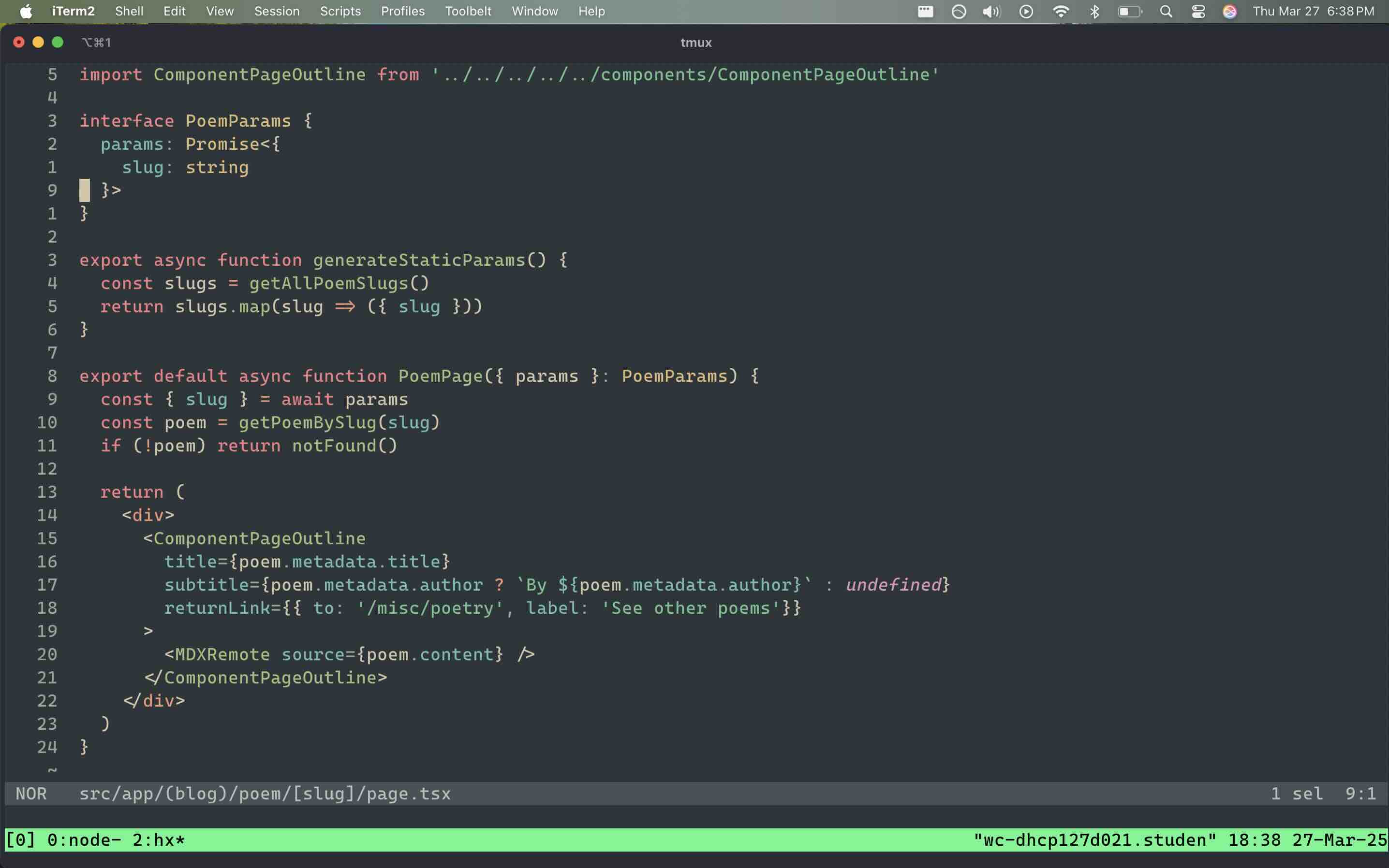
Finally, for anyone whose curious, this site was made in about a week entirely on my 2020 Macbook M1 within the Helix editor, the "post-modern text editor." I come from a long background of using Vim/Neovim, but at some point I just got tired of dealing with my bloated config file. It took a week or so to get comfortable with all of the new keybinds, but after switching to Helix, I haven't looked back and I would say I'm actually typing at a higher speed than before.

On the server-side of things (heh), I'm using NameCheap to manage the domain and Vercel for hosting. Email me if you think either of those are bad, I'm quite uninformed on hosting platforms and would love to learn more.
What's next?
The moment I deployed the site, a plethora of ideas for new features entered my mind: a dedicated credits page; guitar tabs; spanish lessons; blog tags; a currently listening/reading section; the list just goes on. For the time being, I want to focus on writing blog posts and honing in the craft of writing. As I am doing that, I'll still be working on sprucing up the site, making it feel more homely and adding fresh content.
I spend so much of my day surfing through lovely, homemade websites, and my hope is to make a site which, if I myself had accidentally stumbled upon, would enjoy browsing. I'd like to think that I'm giving back to the people that inspired me to pursue this lovely craft in the first place.